
style="border: 2px solid white; border-radius: 50%;"
请问:圆边框目前是白色, 怎么把下半园的圆边框做成绿色,上半圆保持
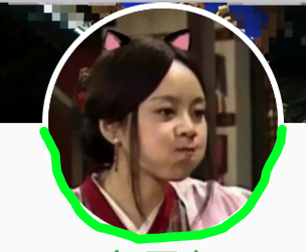
白色。。。
style="border: 2px solid white; border-radius: 50%;"
请问:圆边框目前是白色, 怎么把下半园的圆边框做成绿色,上半圆保持
1***@qq.com - 碧蓝天空自由飞
<template>
<div class="bluetooth-test-button-layout" @click="testBluetooth">
<div class="test">
<div class="centertest"></div>
</div>
<p>点击监测蓝牙</p>
</div>
</template>
<style>
.test{
width: 200px;
height:200px;
/ border-radius: 100px;
border-color: transparent;
background: yellow; /
position: absolute;
left: 0px;
top:100px;
}
.test:before{
content:'';
position: absolute;
left:0px;
top:0px;
width:200px;
height:100px;
background: blue;
border-top-left-radius: 100px;
border-top-right-radius: 100px;
}
.test:after{
content:'';
position: absolute;
left:0px;
top:100px;
width:200px;
height:100px;
background: red;
border-bottom-left-radius: 100px;
border-bottom-right-radius: 100px;
}
.centertest{
width: 98%;
height: 98%;
position: absolute;
z-index: 100;
background: yellow;
border-radius: 100%;
left: 1%;
top:1%;
}
1***@qq.com - 天下风云出我辈
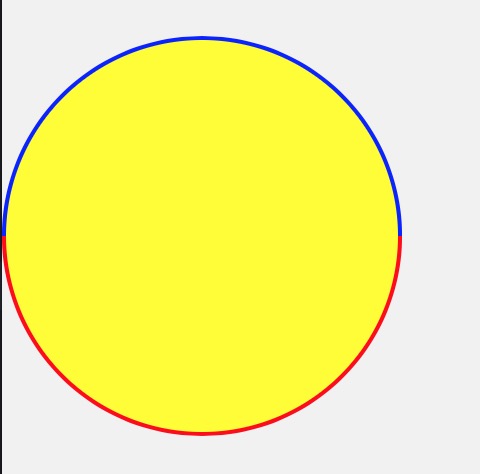
.circle{
width:200px;
height:200px;
border-style:solid;
border-width:10px;
border-radius:50%;
border-color:#f00 #f00 #f0f #f0f;
transform: rotate(-45deg);
        }
        .portrait{
            width:200px;
            height:200px;
            background-image: url(http://g.hiphotos.baidu.com/image/pic/item/c8ea15ce36d3d539f09733493187e950342ab095.jpg);
            background-size:contain;
            background-position: center;
            background-repeat: no-repeat;
            border-radius:50%;
            transform: rotate(45deg);
        }
以下为html内容
<div class="circle">
<div class="portrait"></div>
</div>

1***@qq.com - 碧蓝天空自由飞
width: 200px;
height:200px;
border-radius: 100px;
border-left: 1px solid green;
border-right: 1px solid green;
border-top: 1px solid red;
border-bottom : 1px solid red;
1***@qq.com - 碧蓝天空自由飞
上面的好像也不行,不过你可以通过before 与 after 实现before做上面的一半 after做下面的一半
css:
.example:before{
content:'';
....
}
.example:after{
...
}
.example就是你框子的样式名称
王者地带 - 5+混合APP开发教程网 | http://www.html5-app.com | 咨询QQ: 2564034335
//可以实现的方式挺多的

<!doctype html>
<html>

    <head>
        <meta charset="UTF-8">
        <title></title>
        <meta name="viewport" content="width=device-width,initial-scale=1,minimum-scale=1,maximum-scale=1,user-scalable=no" />
        <link href="css/mui.min.css" rel="stylesheet" />
        <style>

            .avatar
            {
           position: relative;
           width:200px;
           height: 200px;
           margin: 50px;
            }
            .avatar img
             {
                width:200px;
                height: 200px;
                border-radius:200px;
                padding:6px;
                position: absolute;
                z-index:1;
             }
            .avatar:after,.avatar:before
            {
            content:"";
            position: absolute;
            top: 0;
            width:200px;
            height:100px;
            background-color: white;
            border-radius:50%/100% 100%  0 0;
             }
            .avatar:before
            {
            top:auto;
            bottom:0;
            background-color:green;
            transform:rotate(180deg);
            -webkit-transform:rotate(180deg);
            }
        </style>
    </head>

    <body>

    <div class="avatar">
     <img src="img/avatar.jpg"/>
     </div>

    </body>

</html>

DCloud 即数字天堂(北京)网络技术有限公司是W3C成员及HTML5中国产业联盟发起单位
京ICP备12046007号-4 | 京公网安备:11010802035340号 | 国家信息安全等级保护三级,证书编号:11010813802-20001